Pro tips: Painting the Golden Gate Bridge
Pro tip 1: Decide the mood before you begin
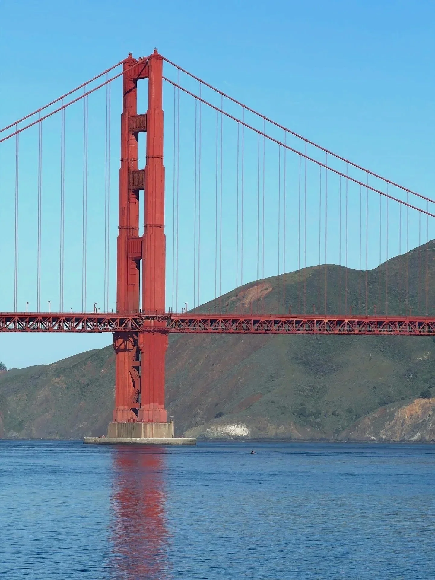
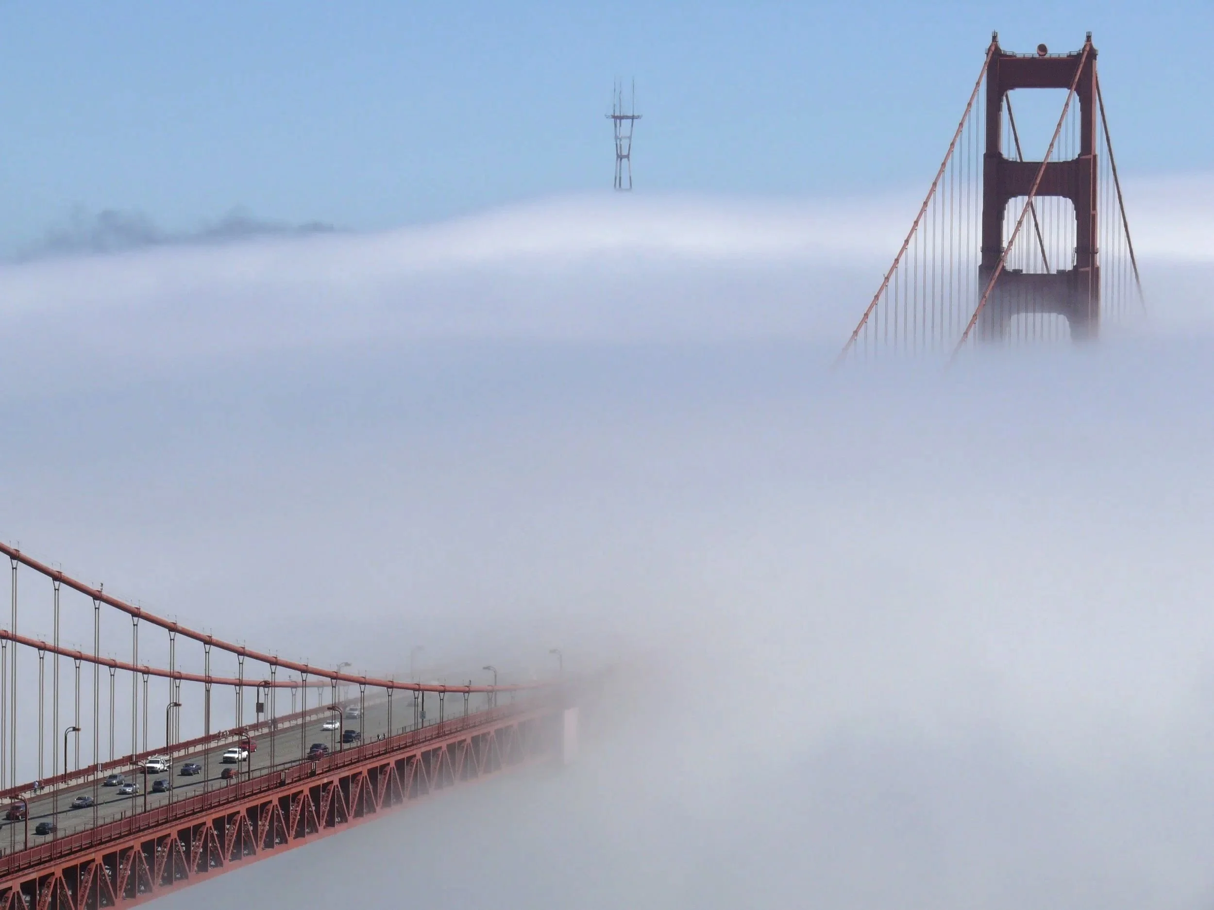
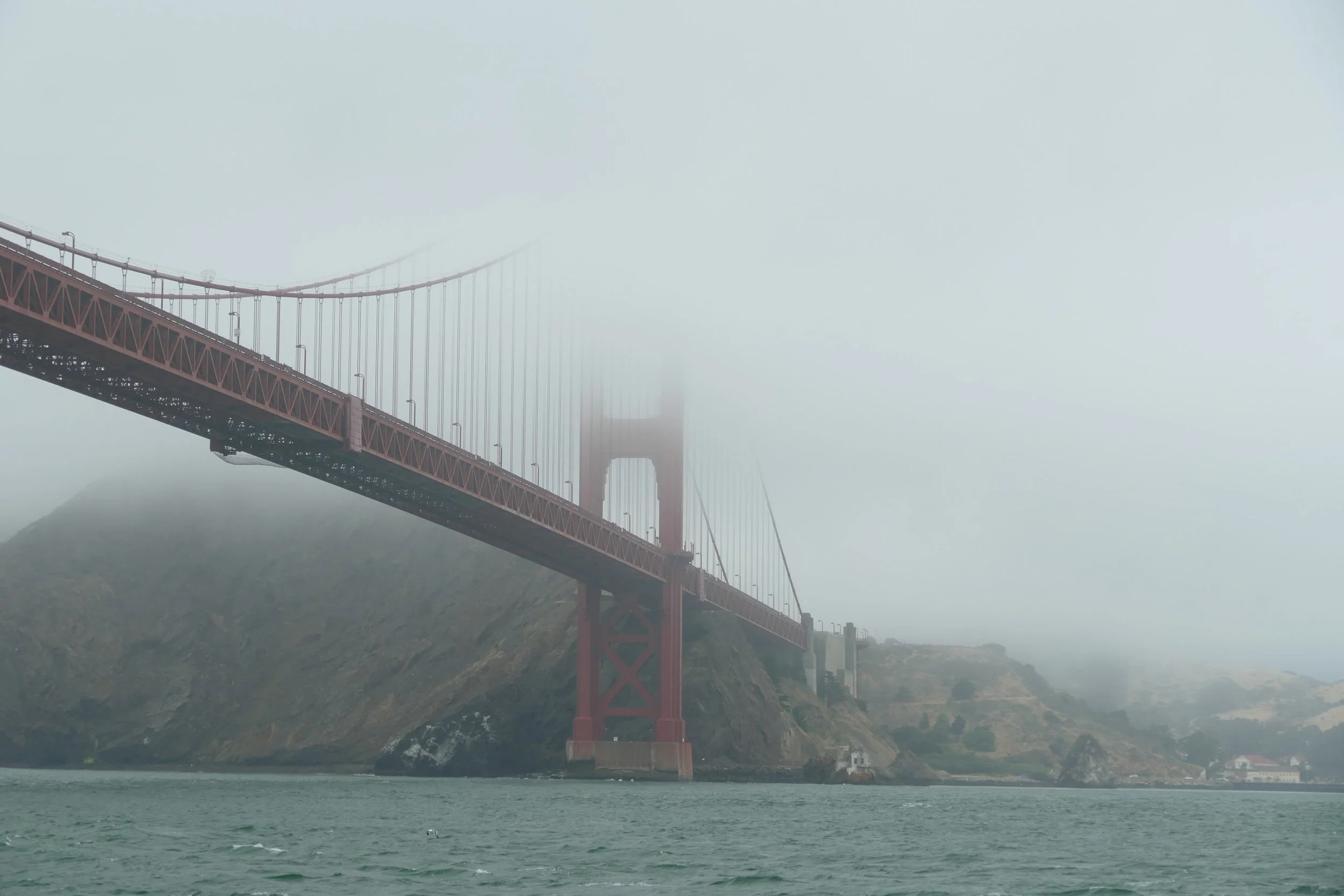
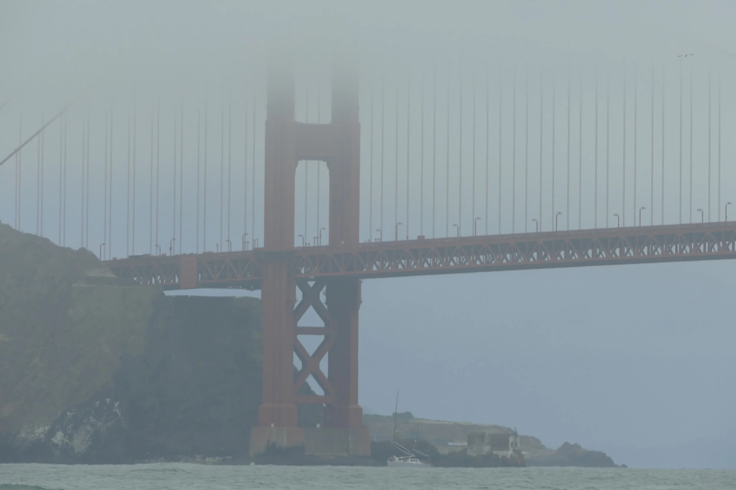
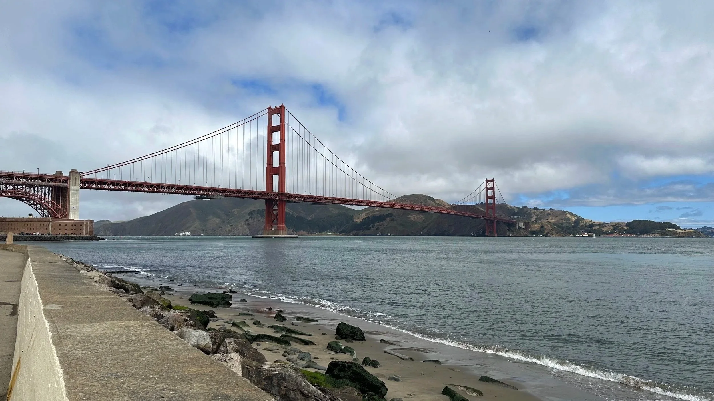
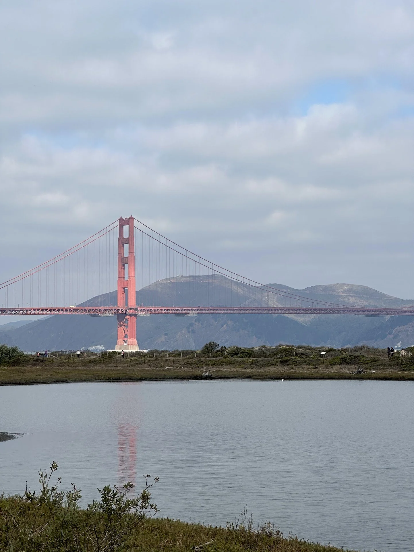
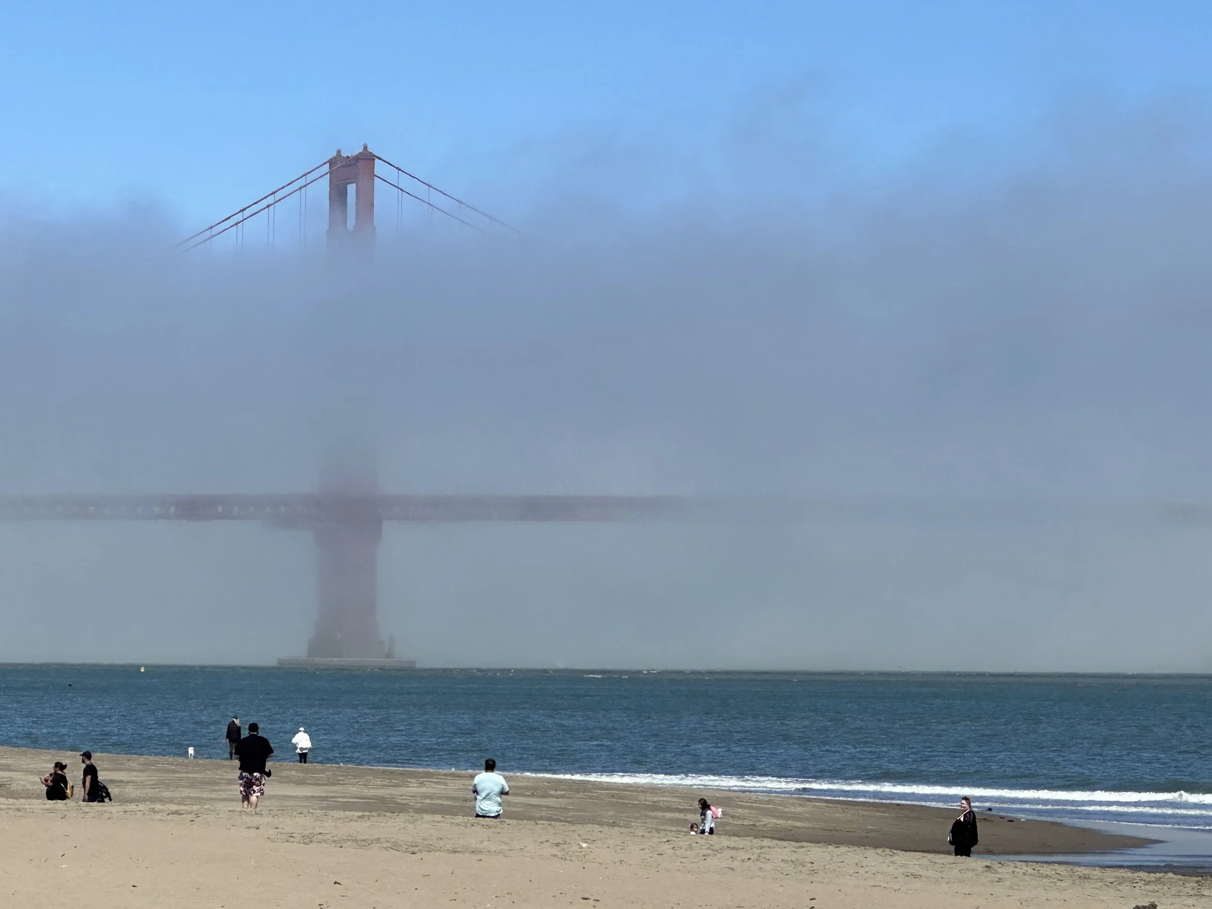
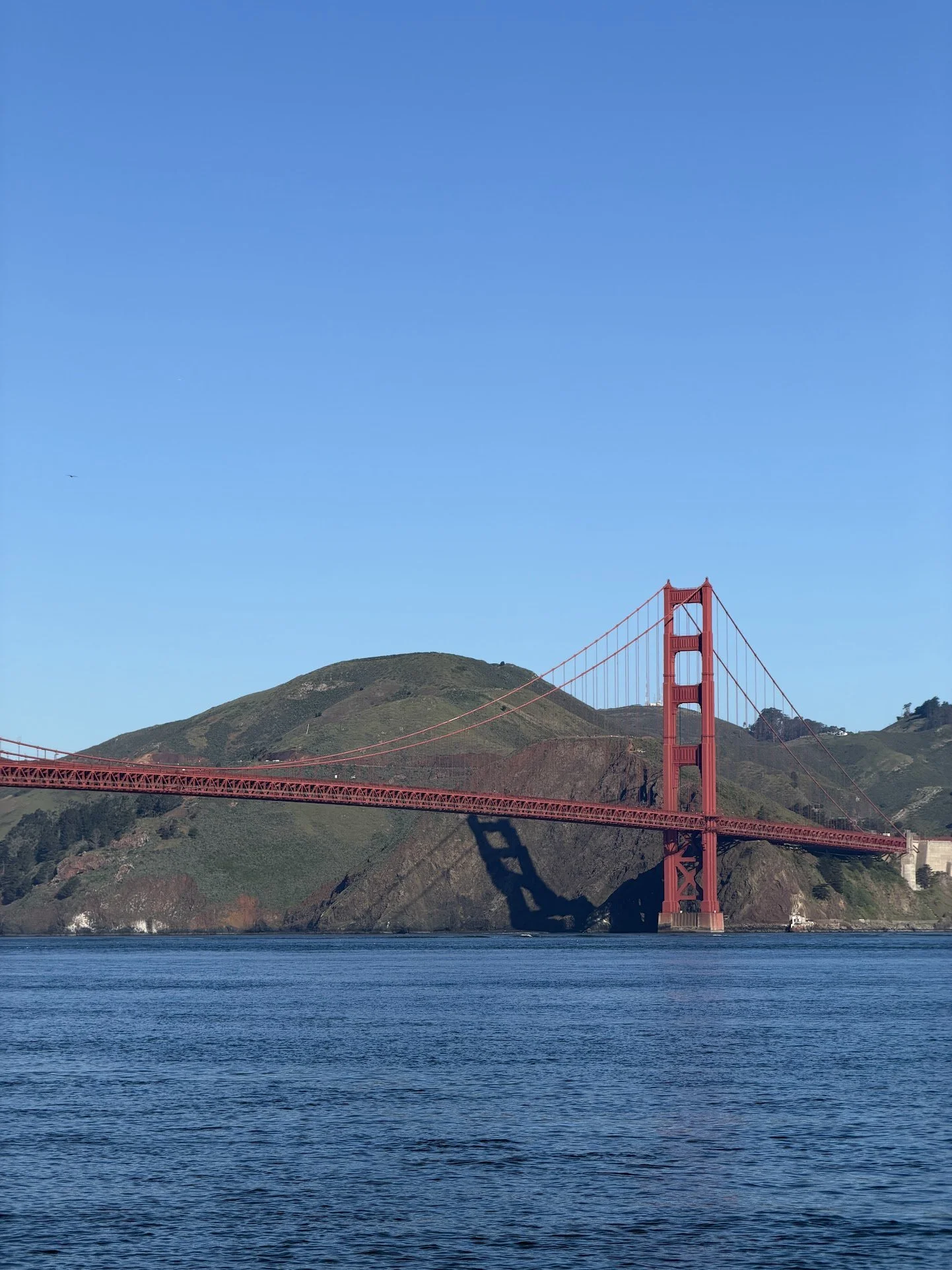
Look at the photos and decide how you want your painting to feel before you begin: foggy and quiet, bright and clear, warm, cool, soft, or dramatic.
Ask yourself:
Should the bridge stand out, or soften into the air?
Should the sky feel open and bright, or heavy with fog?
Should the water feel calm and reflective, or darker and choppier?
Should the overall feeling be warm or cool?
Do not copy one photo exactly. Use them to choose a mood, then paint from there.
Pro tip 2: Let the water help
Fill your water brush and start with the big shapes first: sky, water, land, then bridge.
Keep in mind:
Work one area at a time
For soft skies and distance, paint into damp paper
Start lighter than you think
Keep reflections simple
For crisp bridge edges, let the background dry first
For softer edges, paint the bridge into a slightly damp background
Let some edges stay soft and some areas open. That’s where watercolor feels most alive.
Pro tip 3: Color mixing
You only need a few colors to suggest light, distance, and atmosphere. Start with more water and less pigment, then build slowly.
Try this:
For the bridge, cool your red slightly with a touch of blue
For soft grays, mix a little red into cool blue
For distance: more water, lighter, cooler colors
Save your strongest color for the bridge and final accents
Do not chase an exact match. Aim for mood, light, and place.
Fun facts
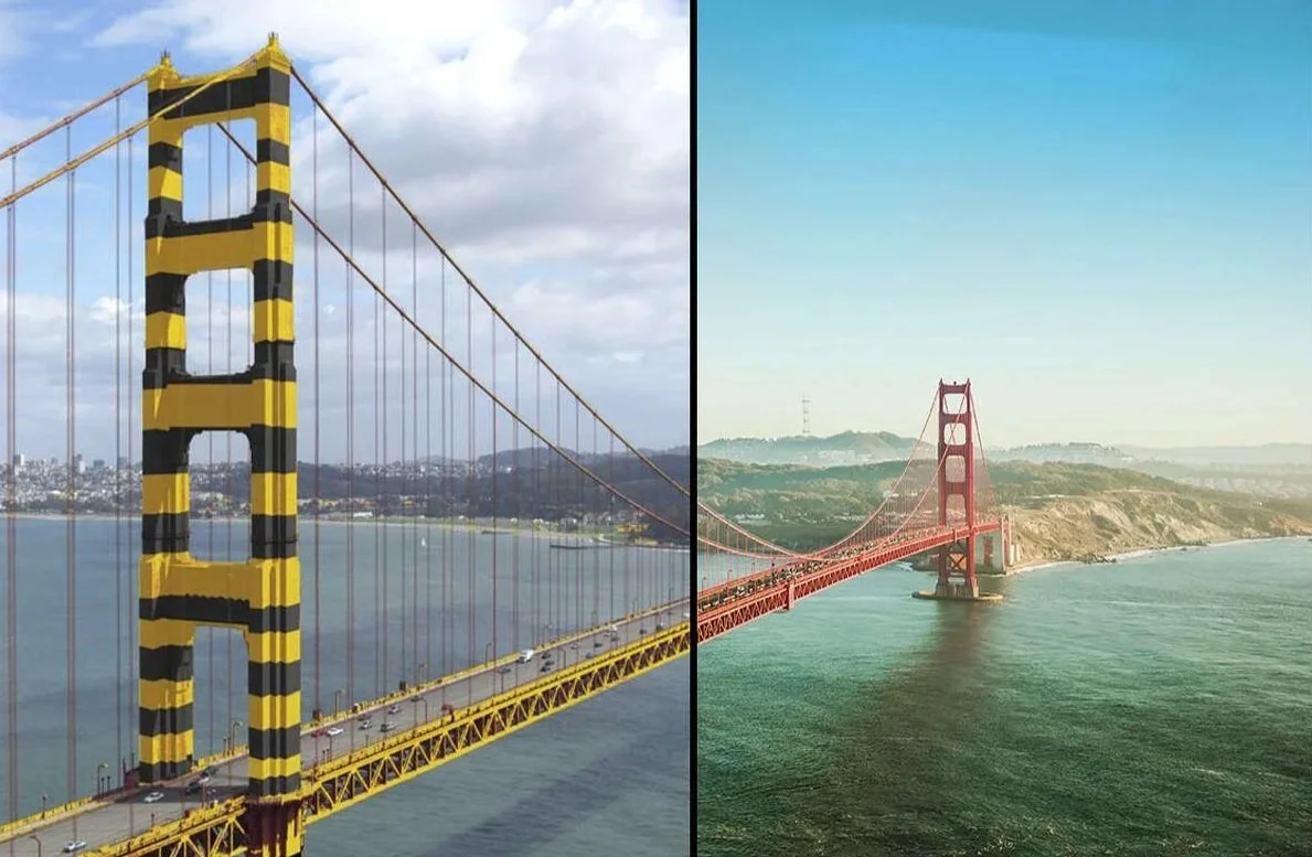
The Golden Gate Bridge is iconic not only because of its scale, but because of its color. Early on, the U.S. Navy proposed painting it in black and yellow stripes so it would stand out in the bay. Instead, what became known as International Orange was chosen, a color that holds its own against fog, water, and changing coastal light.
That choice helped make the bridge instantly recognizable. In bright sun it can feel warm and vivid. In fog it deepens and cools. At a distance it can look quieter and almost suspended in air.
That is part of what makes it so interesting to paint: it is not just a structure, but a color in weather.