Pro tips: Painting cherry blossoms, Spring 2026
Pro tip 1: Decide the mood before you begin
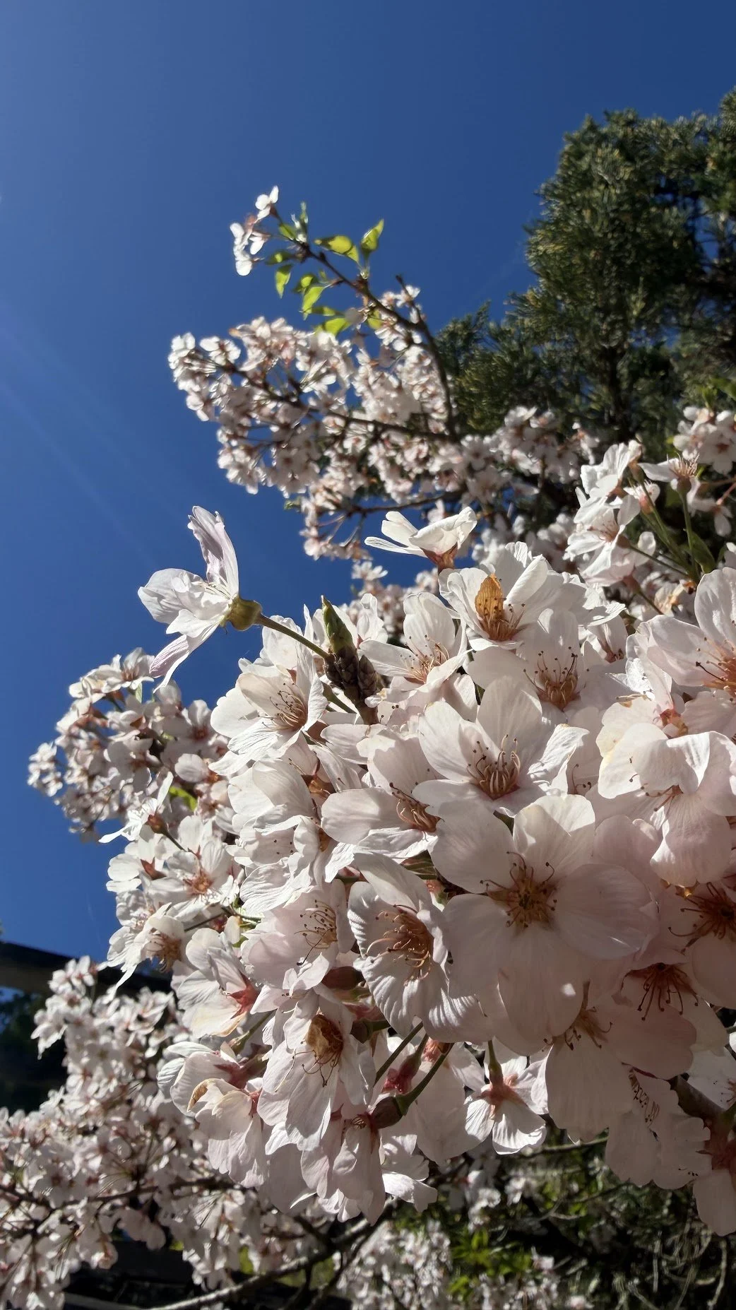
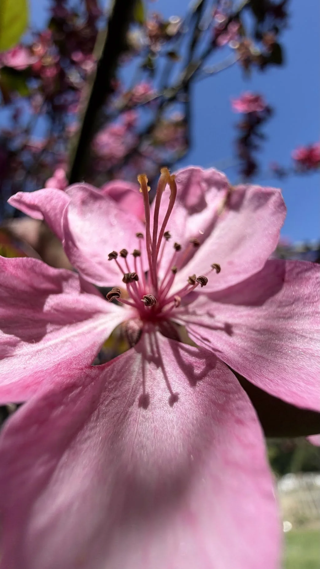
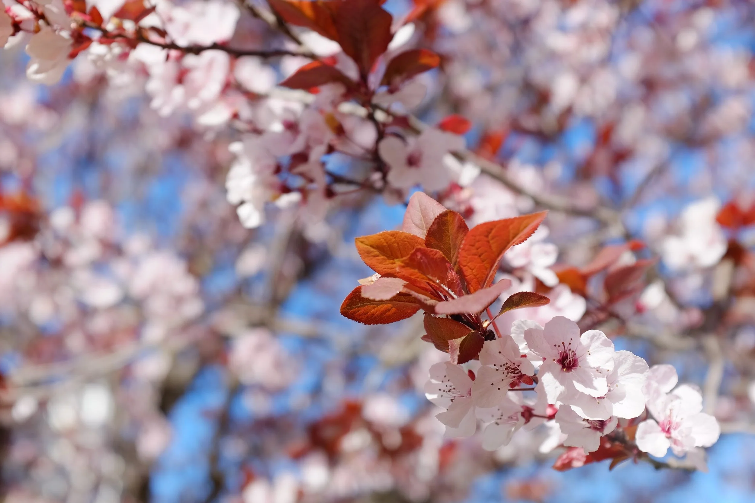
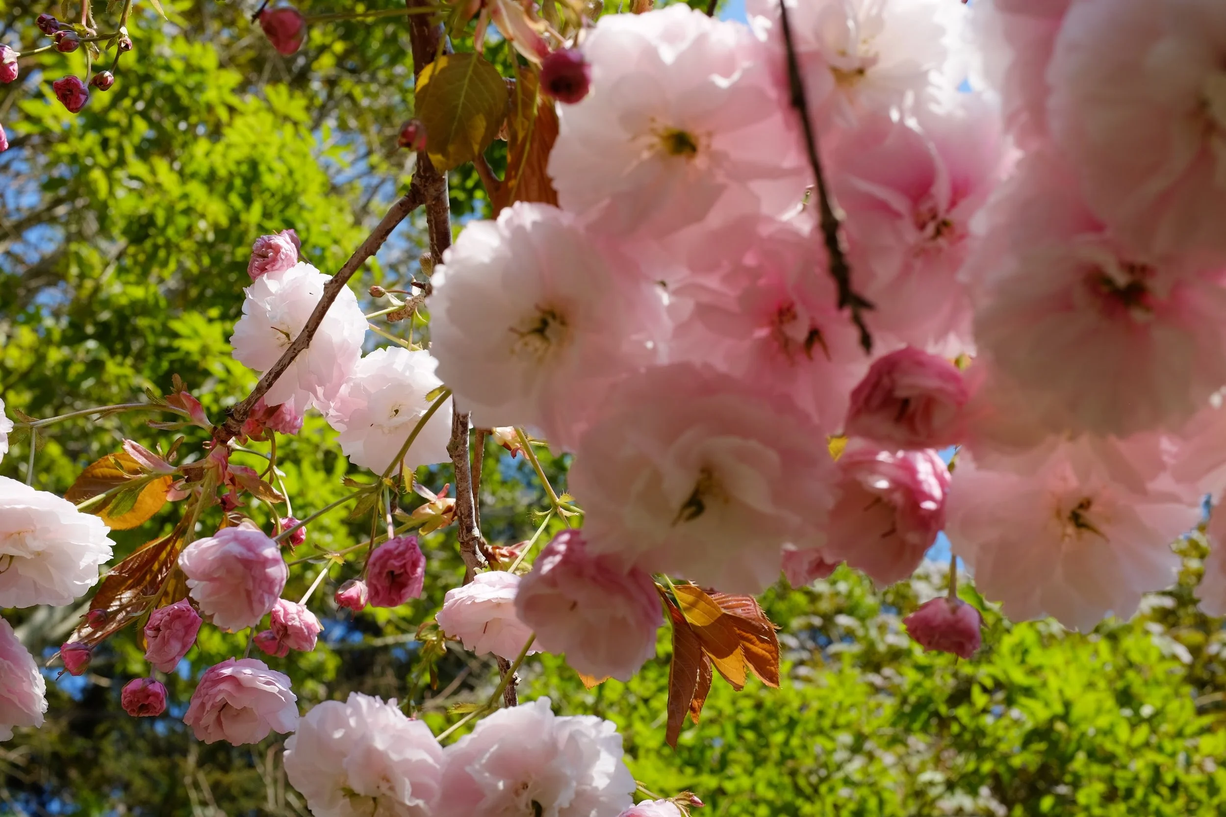
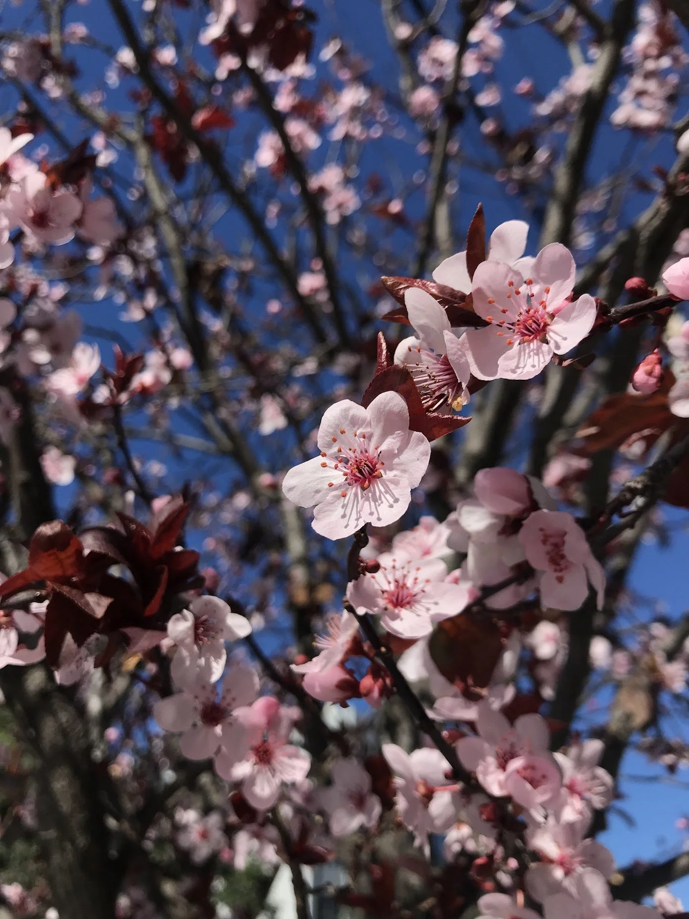
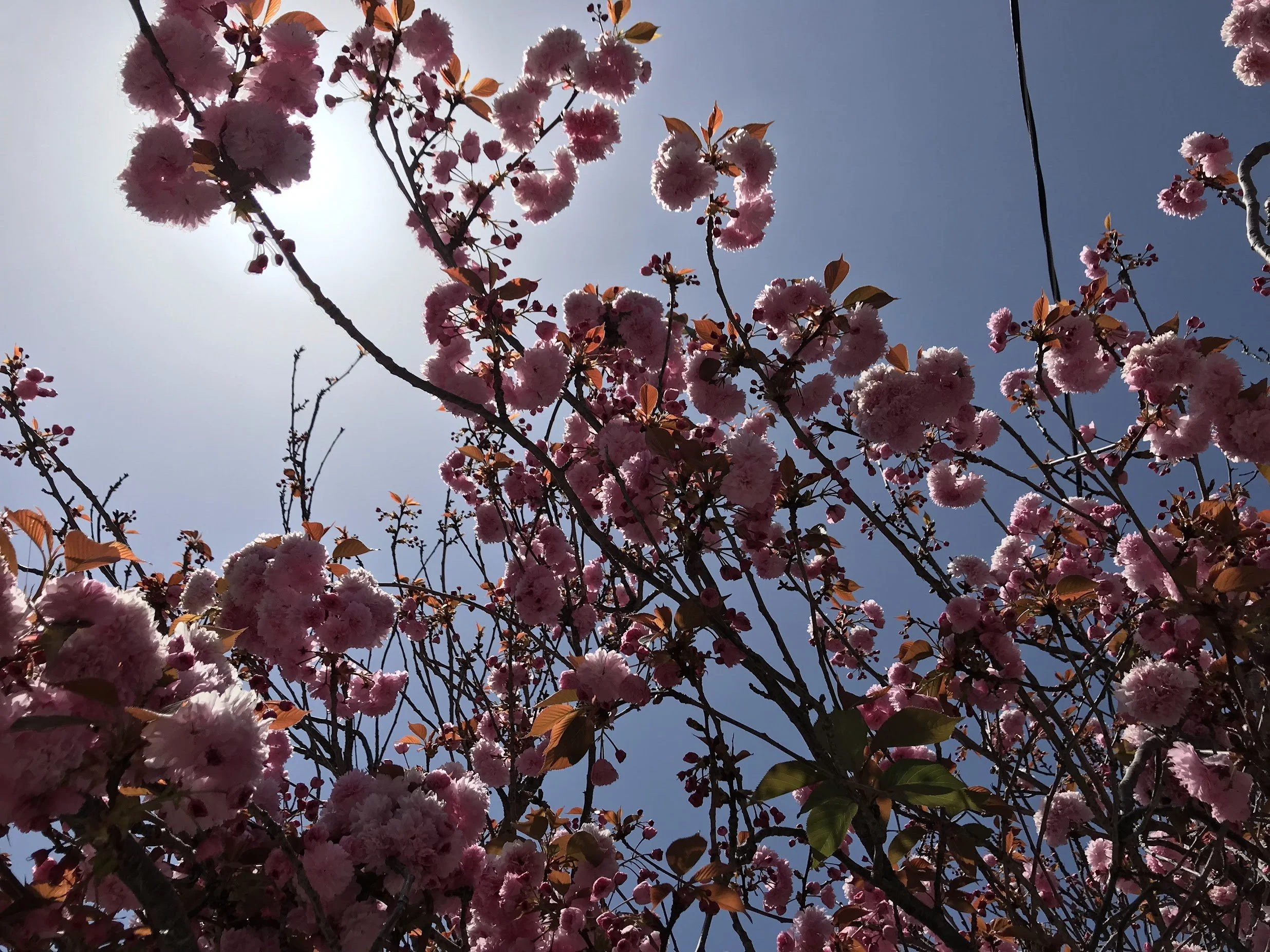
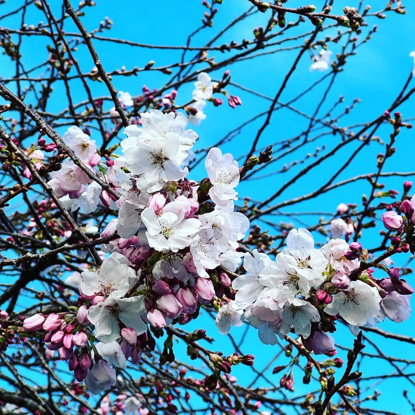
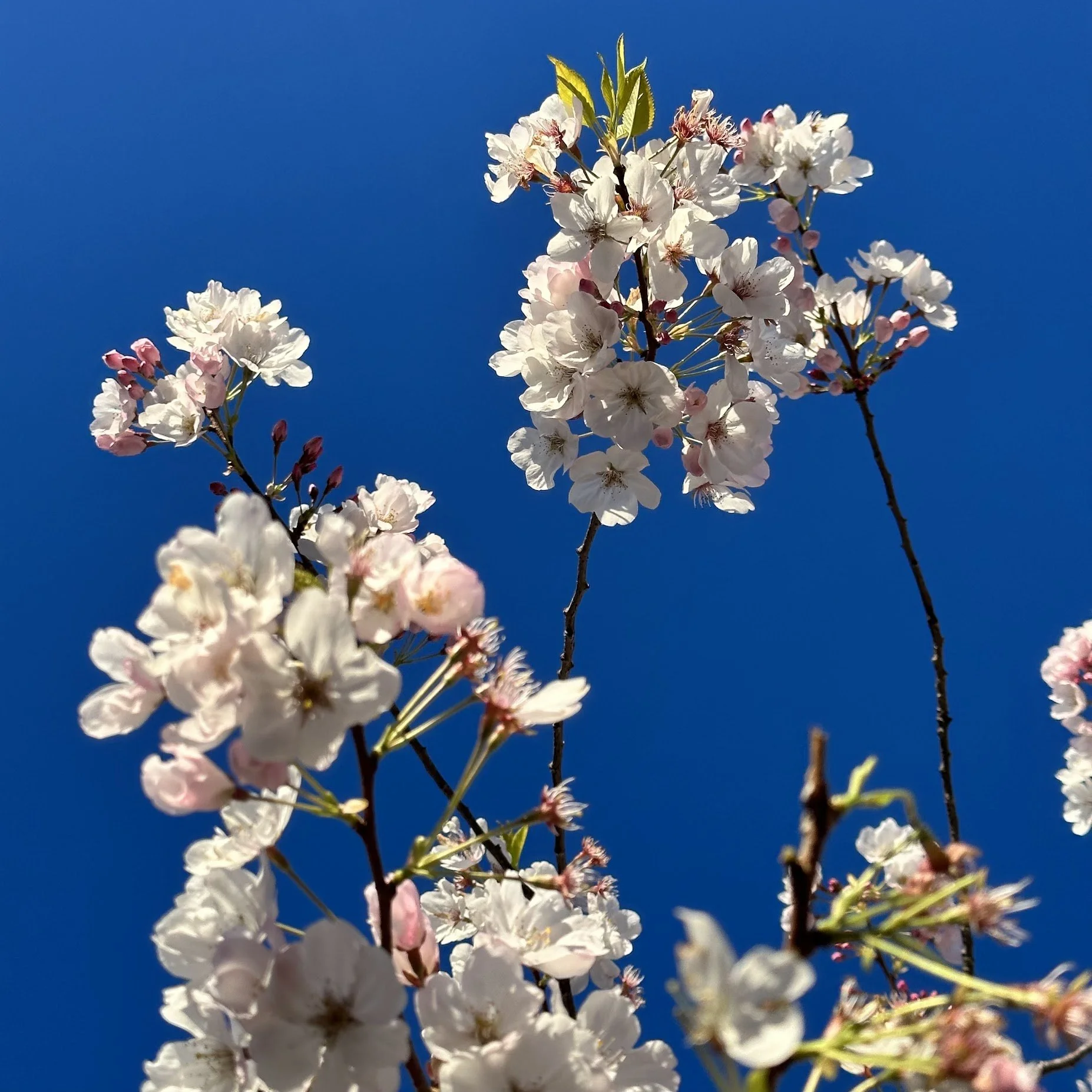
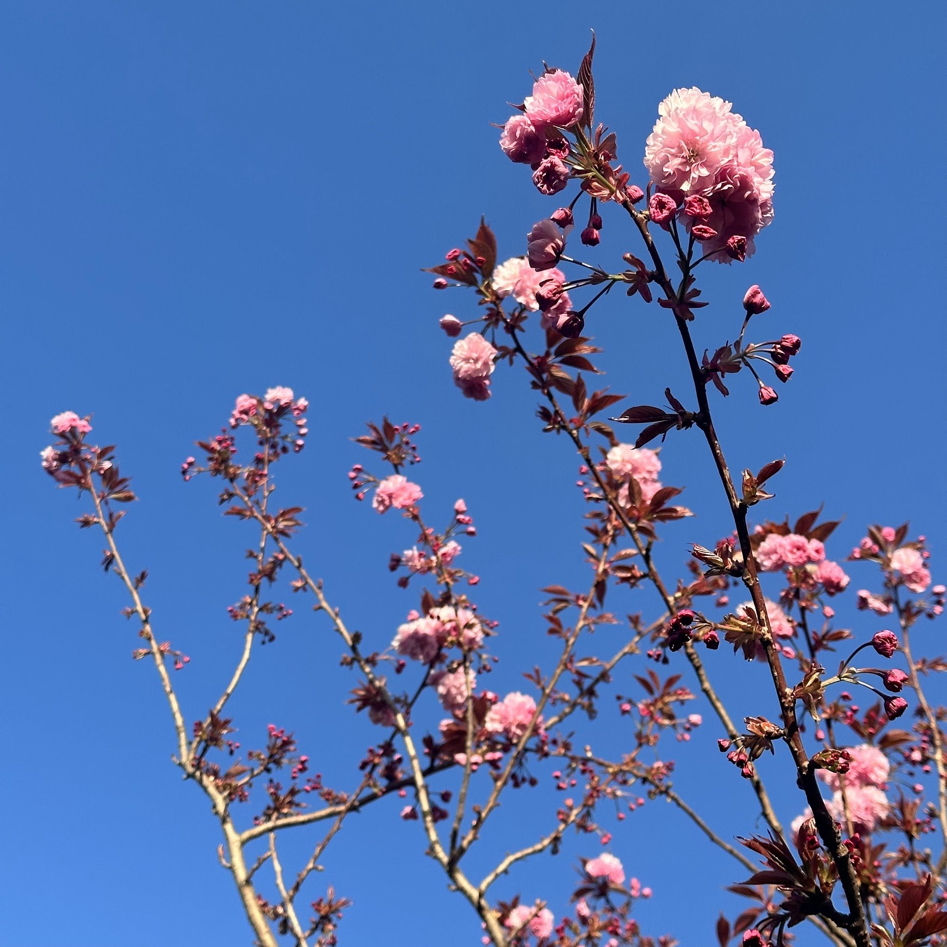
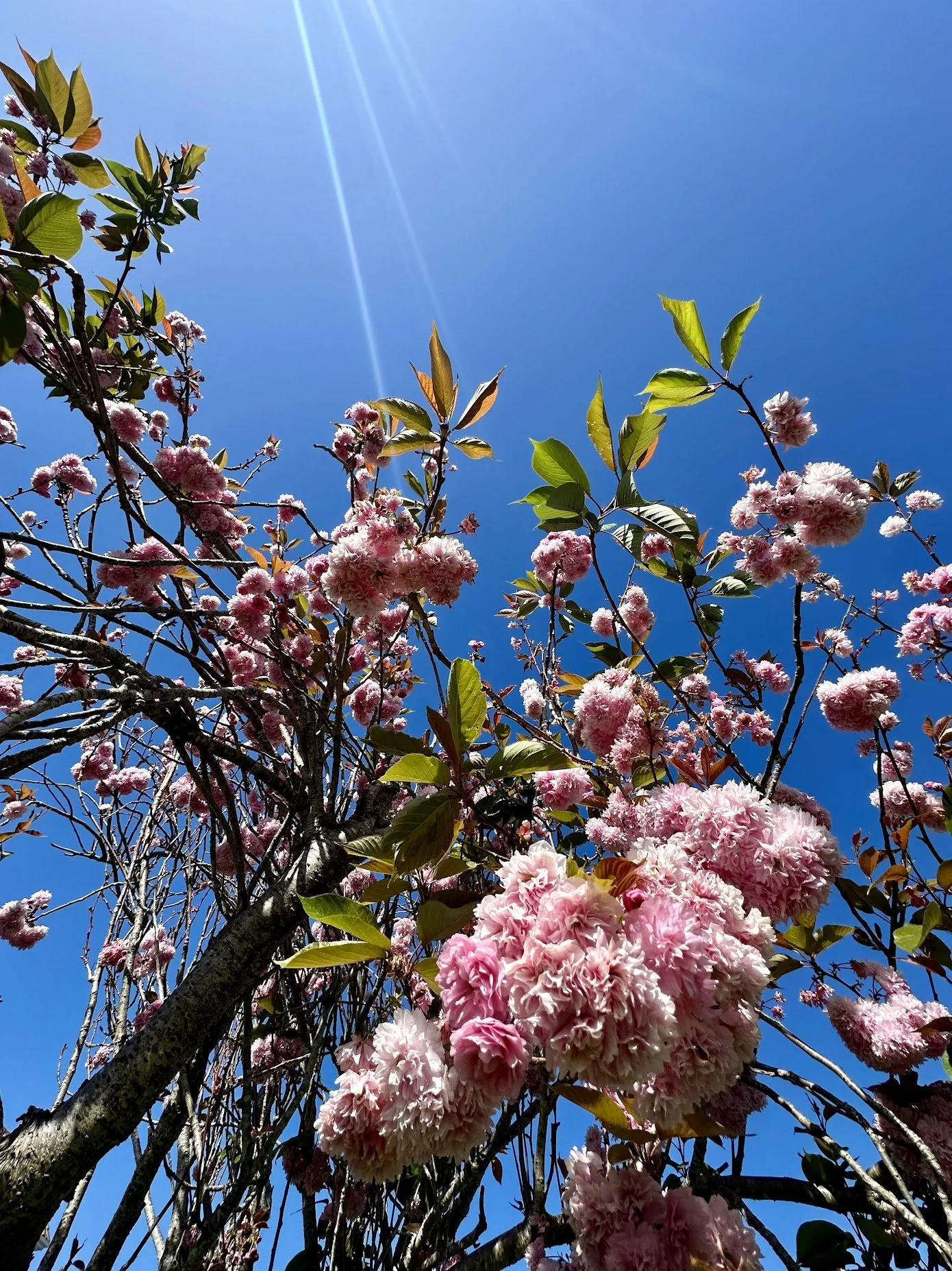
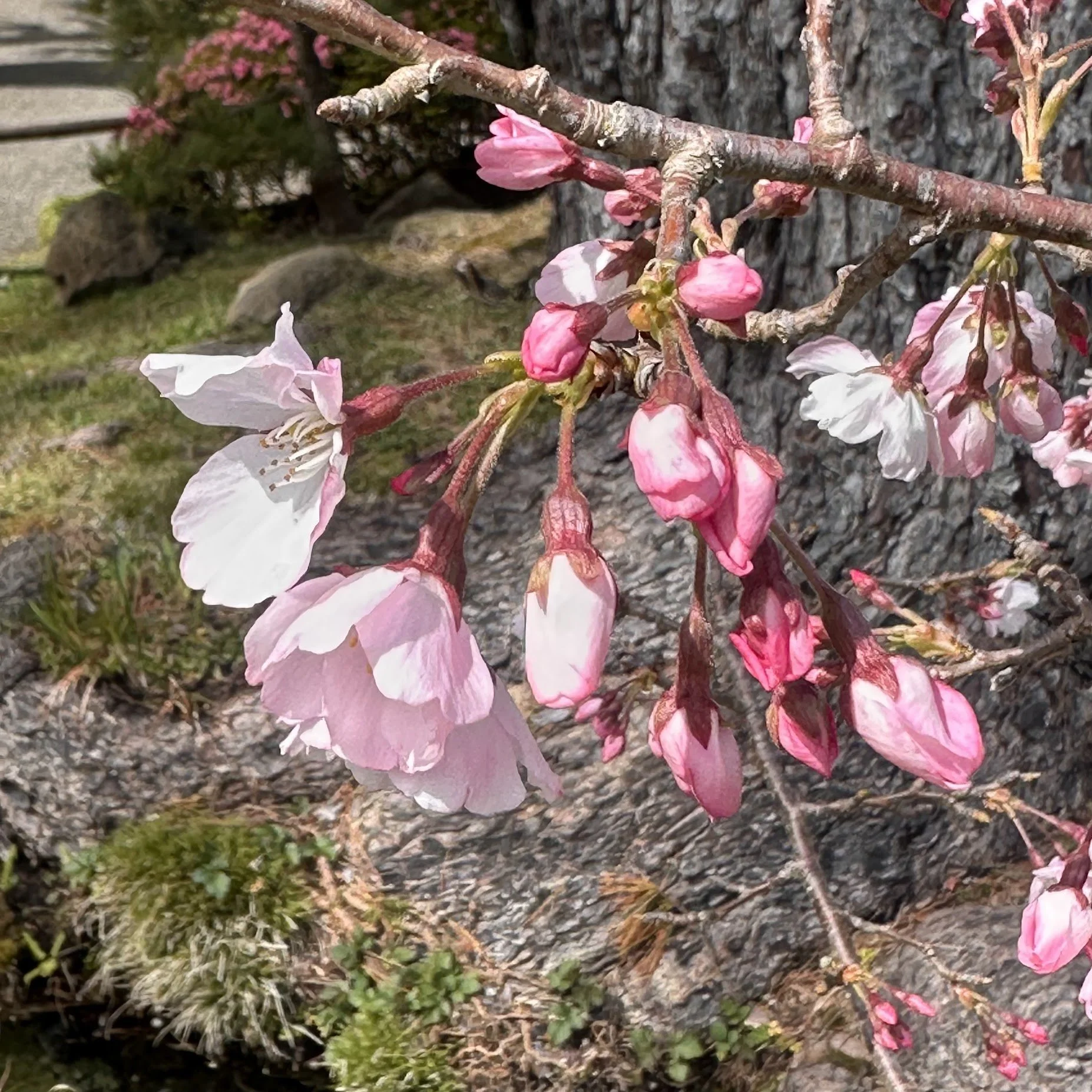
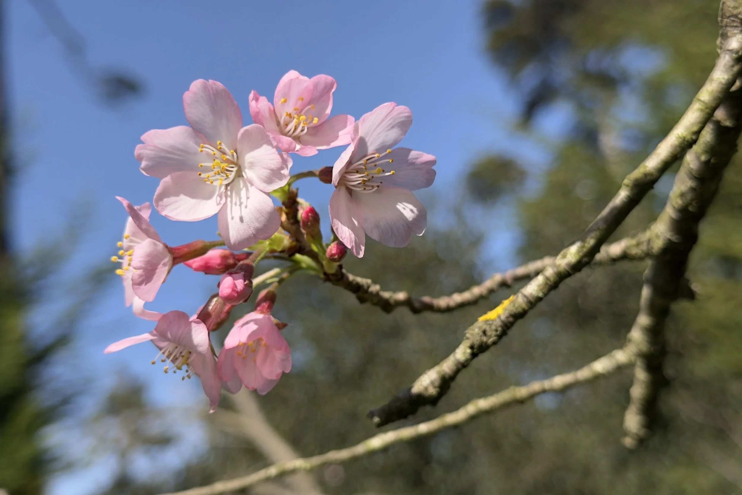
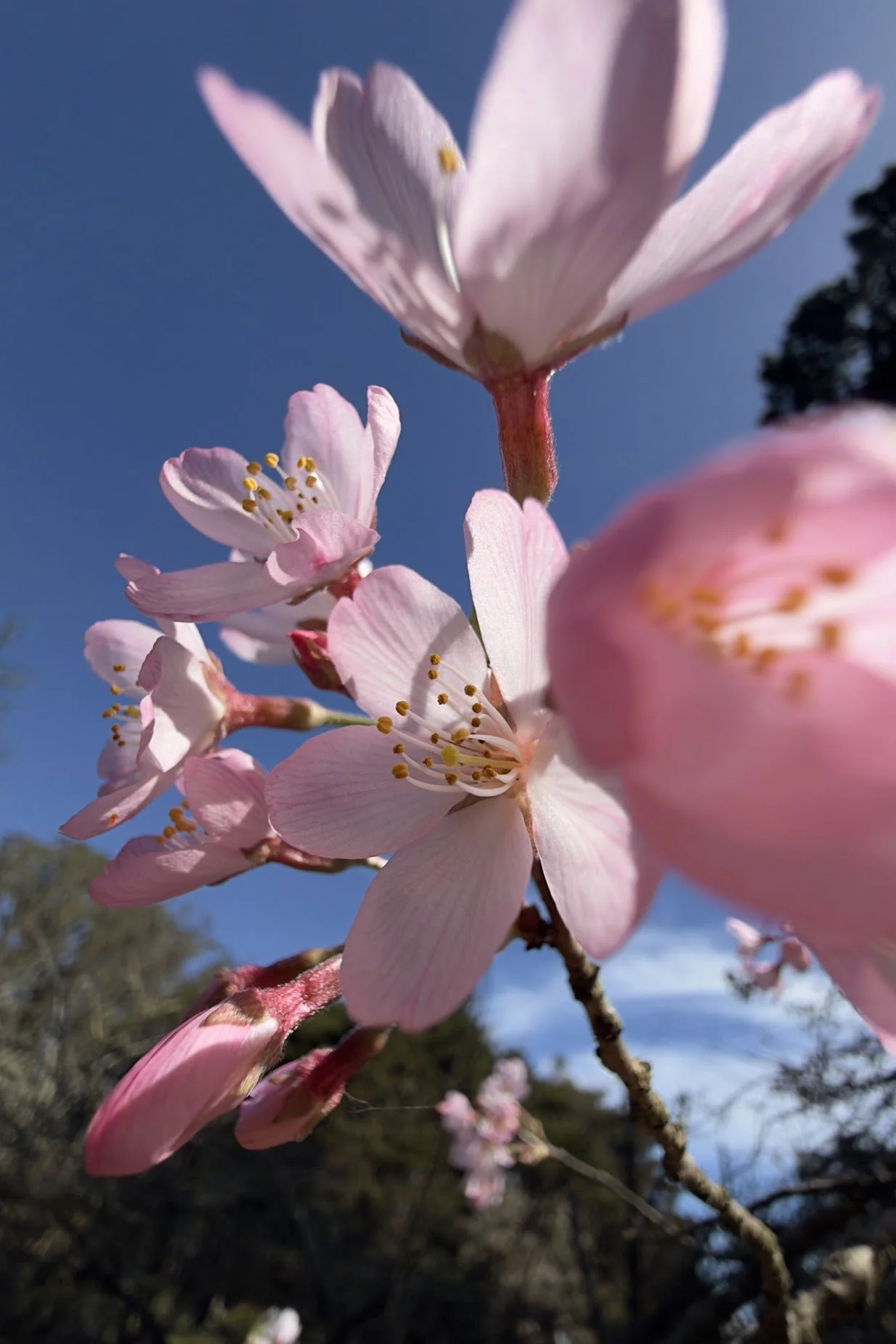
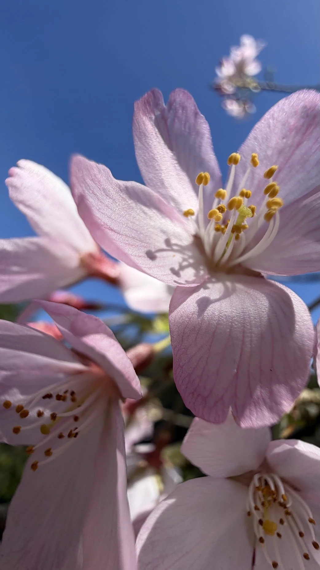
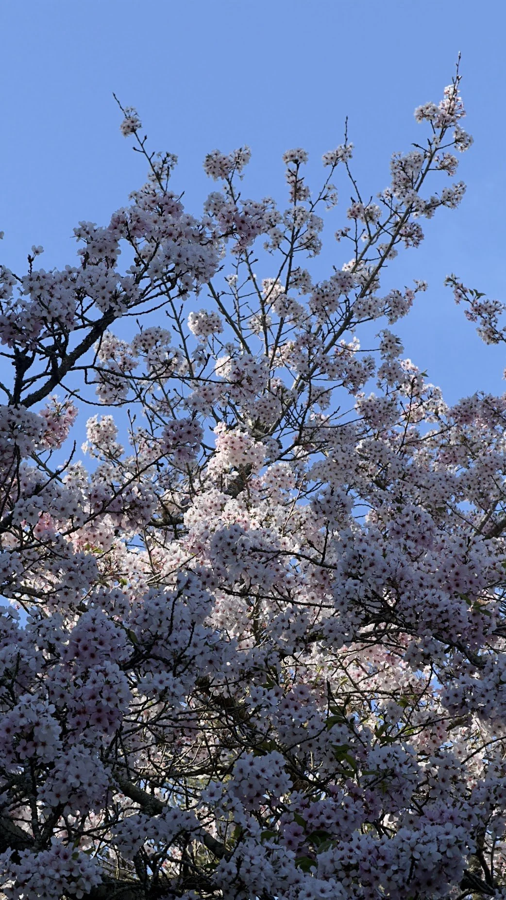
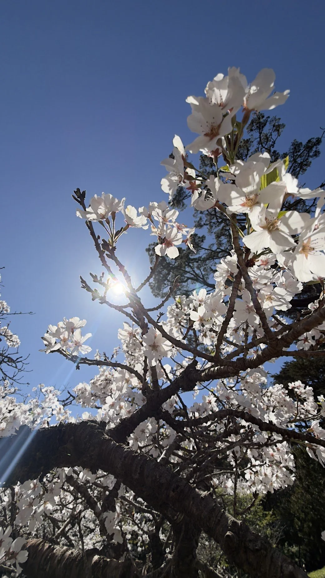
Look at the photos below for inspiration. Take a moment to notice the color, the light, and the mood in each one. Before you begin, decide how you want your painting to feel. You might want it to feel airy and delicate, bright and joyful, quiet and reflective, warm, cool, soft, or full of spring energy.
A few things to think about before painting:
Do you want the blossoms to feel light and fresh, or dense and full?
Do you want the trees to feel calm and still, or alive with people and movement?
Do you want the scene to feel soft and hazy, or crisp and sunlit?
Do you want the overall feeling to be cooler and quieter, or warmer and more festive?
You do not need to copy one photo exactly. Let the images help you choose the feeling you want, then paint from there.
Pro tip 2: Paint the big blossom shapes first
Everything you need to begin is here. Fill your water brush, then start with the biggest shapes first: the blossom canopy, the path or ground, the tree trunks, and the larger groups of people or objects.
A few things to keep in mind as you paint:
Work from the biggest shapes to the smaller ones so the scene stays simple and clear
Try not to paint every blossom one by one. Look for larger clusters and soft masses of color first
For soft blossoms and distant trees, add color to paper that is already slightly damp so it can spread gently
Leave a few light areas untouched so the blossoms keep that airy spring feeling
Add smaller dark accents later in the trunks, branches, bicycles, or figures to help the scene feel grounded
Watercolor often feels most alive when everything is not overdefined. Let the blossom shapes stay a little open and let the water help create softness and light.
Pro tip 3: Color mixing tips
You only need a few colors to create a convincing feeling of blossom light, fresh spring air, and depth. Start with more water and less pigment than you think you need. You can always build color slowly as the painting develops.
A few color tips to help you begin:
For blossoms, use rose as your main color, and soften it with plenty of water so it stays light and delicate
For shadowed blossoms or deeper accents, add a very small touch of earth into your rose
For branches and tree trunks, mix earth with a little cool blue to create softer browns and grays
For grass and leaves, use green, but mute it slightly with a touch of earth so it does not become too sharp
For distance and atmosphere, use cool blue with more water so background areas stay lighter and softer
Save your stronger color and darkest accents for only a few places near the foreground or center of interest
You do not need to match everything exactly. Focus on creating a believable feeling of season, light, and place.
Fun facts
Cherry blossom season in Japan is closely tied to hanami, which means flower viewing. People gather under the blooming trees to eat, talk, rest, and enjoy the short moment when the blossoms are at their peak.
Part of what makes cherry blossoms so meaningful is that they do not last very long. Their brief season has long been associated with transience, change, and the importance of noticing beauty while it is here.
That is part of what makes them so interesting to paint: they are not only flowers, but atmosphere. From far away they can feel like clouds of color, while up close they dissolve into small shifts of pink, light, branch, and air.
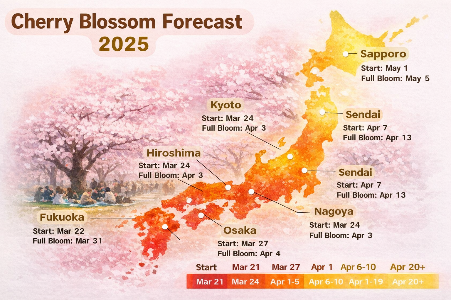
In Japan, blossom forecasts are followed almost like weather news. People pay close attention to when the cherry trees will begin to open and when they will reach full bloom, because the peak can be brief and shifts from place to place each year.